Seasonal Shades: Your Guide to Spring and Summer’s Hottest Colours
by Northern Life
Spring is here, and with a fresh season comes a new colour palette for your home. From the neutral shade of Sage to the eye-catching Statement Turquoise, the latest colour trends are everywhere – but why have they been chosen? We look at spring and summer’s hottest shades and why they are set to sparkle this season.
Green
- Luxore Side & Coffee Table Set £379 available from La Redoute
- Bamboo Texture Green Wallpaper £40 a roll available from Graham & Brown
- Jimi Vintage Two-Tier Coffee Table £149 available from La Redoute
- Set of 4 green stackable dining chairs £380 available from Habitat
- Bexley Seaspray Stripe Wool Rug from £60 available from Laura Ashley
- Orla Kiely Linear Stem Cushion, Apple £40 available from John Lewis
- Ritchie 2 Seater Sofa, Lime Green £499 available from Made
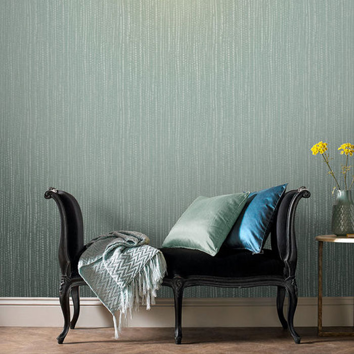
Think freshly mowed lawns, stems, leaves and flower buds, and it’s not surprising that the Season of Flowers features green within its colour palette. This spring and summer will see plenty of verdant hues, from the ‘it’ colour Sage to vibrant Cactus Green.
Spring starts softly with muted shades and gelato colours rising to popularity. Tipped by Pinterest as the new neutral, Sage is already replacing beige, stone and white – providing balance between the comforting security of a neutral and the slightly bolder green tone. As earthy neutrals, The Standard also predicts Jade and Olive to become popular pastels.
Moving into summer, we predict an abundance of vivid shades decorating homeware accessories and walls across the nation. Rich pigments are tipped to stand out, with Emerald Green in particular set to ‘pop’ in this year’s colour palette. It’s not just brighter colours getting all the love, though, strong shades are expected to grace our homes this summer too. Forest Green ties in with the increasing popularity of moody interiors, while Cactus Green offers a fresh finishing touch to summer interior trends.
Why are we so attracted to green, you ask? Many of us find that getting closer to nature is an excellent way of relaxing, and the primary colour of nature is no exception. There’s no better way to de-stress than by having reviving colours in your home. In fact, in many Western cultures, the colour green is often closely related to feeling refreshed – not unlike those cold drinks you’ll be enjoying as the weather gets warmer!
Yellow
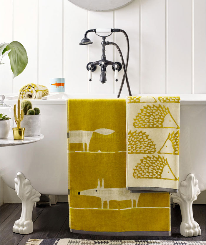
- Scion Mr Fox Towels, Mustard £12 – £44 available from John Lewis
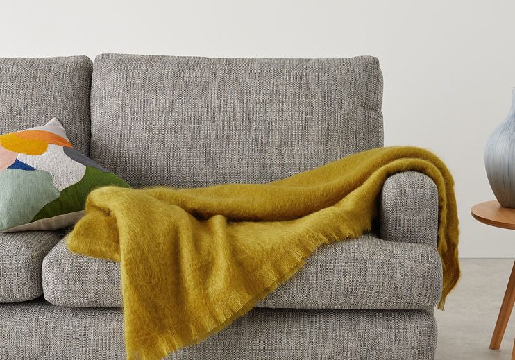
- Mylo Mohair Throw £79 available from Made
- available from John Lewis Egyptian Cotton Towels, Sunshine £2 – £30
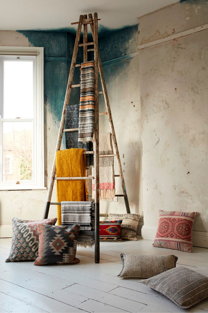
- Mustard Aztec Patterned Throw £45 available from French Connection
- Sophie Conran for Portmeirion Honey Pot Mug, Sunshine £10 available from John Lewis
- Yellow Janik Side Table £53 available from Janik Side Table
- Yellow metal desk clock £35 available from Habitat
From statement sunflower shades, to the rich and regal golden ochre, yellow is making a comeback, proving that you needn’t fear the fun colour. Turning to goldenrod shades will provide you with a cheerful, mood-lifting statement in your home. Use it as a pop of colour or pair with cream and blue accent colours for an organic and natural vibe, as Elle recommends.
In line with the gelato colours trend, try a soft lemon to add a fun and fresh twist to your kitchen. Or, if you are feeling brave, why not opt for a yellow wall for a truly sunny finish? Golden Ochre has even been selected as a colour of the year by Valspar, who believe that it brings the joyful disposition of a Marigold – what a compliment!
Psychologically, of course, in the season of sunshine – we as humans naturally gravitate towards Yellow for a happiness boost – in the same way that sunshine naturally boost serotonin. The colour of gold and wealth, Yellow brings a sense of joy and fun wherever it is found. It’s considered the lucky colour of Monday in Thailand and is a sign of wealth in many African nations.
Blue
- Helia Polycotton Placemats £13 available from La Redoute
- OLMO Dark blue 12 piece dinner set £100 available from Habitat
- Madison Floor Lamp, Navy Blue and Dark Wood £169 available from Made
- Lulu Ottoman Bench, Indigo Blue £399 available from Made
- Juliet Duck Egg Droplets Pendant £100 available from Laura Ashley
- Gothic Damask Flock Cobalt Wallpaper £75 a roll available from Graham & Brown
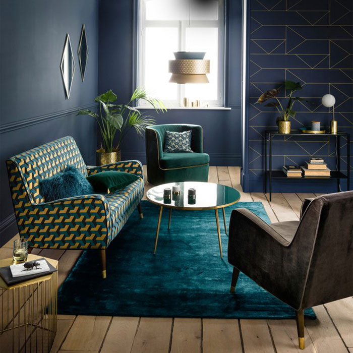
Blue is back this year. Not only is it back, it represents one of the most versatile shades within interior trends at the moment too. From Navy to the serene Oval Room Blue, we are seeing this colour category everywhere, and for good reason.
For springtime, Oval Room Blue adds fast drama and inspires change, according to designer Lauren McGrath. Of course, the grey-toned blue hue also appeals to neutral lovers stepping away from beige and back into those muted shades that are filling this season’s colour palette. Navy is another way to incorporate blue without stepping too far into the bold and bright tones, as it’s been seen within several moody themed interiors this year.
Daring shades of blue for summer include Statement Turquoise and Oceanside, both available from Sherwin Williams. Statement Turquoise is perfect for making a bold splash. Use it for an entire wall, or tone it down and use as a popping accent shade. Oceanside is slightly more green-toned for those who are feeling adventurous. In fact, the Director of Colour Marketing at Sherwin Williams even describes it as “the colour of wanderlust, right in our own homes.” If that doesn’t make you want to get out and about – nothing will!
Although associated with more emotions than any other colour, Blue is perhaps best known for being a calming and peaceful shade, which is why we all like it so much. Think of a blue sky on a sunny day, the feeling of deep and profound harmony that it creates, and imagine replicating that feeling in your home.
Violet
- Bark 250 x 260cm 100% Cotton Bedspread, Indigo £59 available from Made
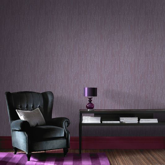
- Crushed Silk Purple Wallpaper £145 available from Habitat
- Wooden floor lamp with lilac velvet shade £145 available from Habitat
- Wool and the Gang Crazy Sexy Super Chunky Yarn, 200g, Ultraviolet available from John Lewis
- Renzo Cotton Tufted Rug £139 available from La Redoute
- LSA International Bud Vase and Tealight Holder, Violet available from John Lewis
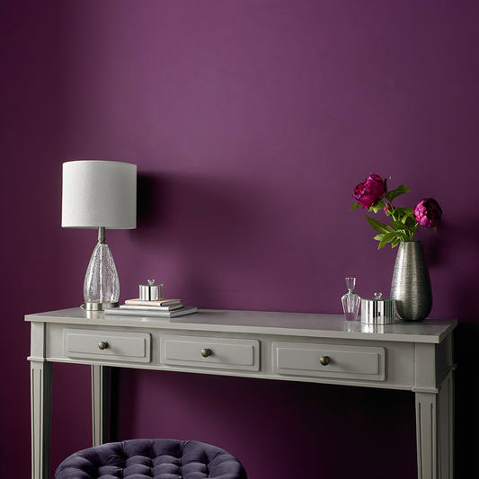
- Damson in Distress Matt Emulsion Paint 2.5L available from Graham & Brown
Rising to prominence thanks to Pantone’s Colour of the Year, Violet perfectly matches the trends of rich pigments and moody interiors. These are the mixed red and blue blends that you need to know about.
Ultraviolet is everywhere, largely thanks to been chosen as Pantone’s Colour of the Year for 2018 and we admit, the shade is both bold and beautiful. In fact, Pantone have described Ultra Violet as “a dramatically provocative and thoughtful purple shade.” If you’re feeling daring, then get your paintbrush out and apply to your walls. If you just want to subtly incorporate the trend, however, we’d recommend using it as an accent colour for soft furnishings.
Away from Ultra Violet, more brooding violet tones such as Deep Aubergine may not be what you’d immediately expect for a spring and summer palette, however, these deeper hues have been spotted on plenty of furnishings helping to create a darker, moodier theme.
So why is violet so popular? According to CTD Tiles, Violet balances Red’s excitement with Blue’s calm and is known for stimulating creativity. Of the seven Indian spiritual chakras, the Crown Chakra, or Sahasrara, is located at the top of the head and is represented by the colour violet. From here, the Crown Chakra said to link to the brain and nervous system, unlocking the pure creative thought locked within.
Whether you prefer sunnier shades or mysterious and maudlin tones, the colour palette for spring and summer 2018 won’t be forgotten any time soon.
